
Introduction
Today, city and transportation planners want to know where people ride bikes. Crowdsourced bike ridership data is available at the network level, which provides a high level of spatial and temporal resolution. However, sources (such as Strava Metro) suffer from criticism that claims crowdsourced data is often derived from a biased sample. In-ground or other local sensors can count all passing bicyclists resulting in high temporal resolution, but unless sensors are installed on every street link, in-ground sensors can’t provide a very high level of spatial resolution.
This study provides another lens to explore how crowdsourced data can be used to gain insight into the way varied populations of cyclists use their local transportation system. Bike share data from the Twin Cities, Nice Ride MN program was used to generate a network level analysis that explores route preference using a cycle specific routing algorithm from GraphHopper accessed through the stplanr package in R.
If you want to know more about how the GraphHopper routing function works, you can review this comment or the source code as Java code here.
The methods described in this post expands upon previous work by Robin Lovelace. This work applies the established methods to infer potential route popularity of bike share users using the original station to station origin-destination (OD) data. The results of this analysis help to understand the differences in spatial preferences at different times and among different groups of people. This type of research could be used for planning activities such as bike share program optimization, tailored marketing, bike share system expansions, corridor analyses, wayfinding planning, feasibility studies, modeling, master planning, and much more.
In the next section, a brief description of the Nice Ride MN bike share program is provided, followed by a description of the data and methods, along with the results of the analysis.
Summary of the Bike Share Program
Nice Ride MN is a public bike share program in the Minneapolis – St. Paul, Twin Cities area of Minnesota. The program launched in 2010 as a non-profit with the intention of providing people with a healthy and sustainable way to get around. Currently, Nice Ride MN maintains over 1800 bicycles across 200 + stations for 24/7 bike share use during April through November. Rental options can be purchased as a single or one-off hire, as well as through a 24-hour, 30-day, or an annual membership. As of March 2018, the Nice Ride MN system will transition into the hands of Motivate.
The Data and Methods
This analysis used origin-destination (OD) data from each journey made in 2017 in the Nice Ride MN program (n = 460,718). The OD data were extracted from the Nice Ride MN data portal which contains system use data dating back to 2010. Data were prepared and analyzed in QGIS and R.
Visualizing Half a Million Bike Share Trips
For this study, the stplanr package required location and trip data. The package can handle spatial objects (shapefiles) and therefore, before I started with R, I created a station location shapefile in QGIS. After that, I switched to R and loaded the required libraries into my workspace.
library(stplanr)
library(rgdal)
library(tmap)
Next, I set my drawing mode to “view” for interactive viewing. This helped visualize the data over a base map.
tmap_mode("view")
The objects “cents” was created from my station location shapefile, and the hire data was created as “bike_share_hires”, from the bike hire data.
setwd("D:\\Bike Share Analysis\\Nice_ride_data_2017_season\\Nice_ride_data_2017_season")
cents <- readOGR(dsn = ".", layer = "nice_ride_location_2017_WGS84") # this file was generated by converting the original location into a shapefile
bike_share_hires <- read.csv("Nice_ride_trip_history_2017_season.csv", sep = ",", header = T)
At this point, I loaded my GraphHopper API token into the system environment.
fileName <- "graphhopper.txt"
mytoken <- readChar(fileName, file.info(fileName)$size)
Sys.setenv(GRAPHHOPPER = mytoken)
Next, since the bike hire data listed each individual hire and because I wanted annual OD hire counts, I created a “hire” variable with the value 1 for each hire, then aggregated the number of hires by origin and destination station number.
bike_share_hires$hire <- 1
flow <- aggregate(hire ~ Start.station.number + End.station.number, data = bike_share_hires, FUN = sum)
Next, I removed hires that started or finished at NRHQ (n = 158) because I didn’t have coordinates for (what I’m assuming to be) the Nice Ride MN headquarters.
ind <- which(with( flow, End.station.number == "NRHQ" | Start.station.number == "NRHQ" )) # remove NRHQ bc no coordinates for location
ind # make sure
f <- flow[ -ind, ] # remove from flow
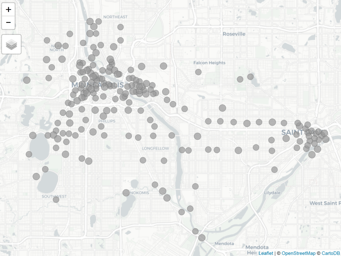
Next, I visualized the station locations.
qtm(cents, symbols.size = .5)
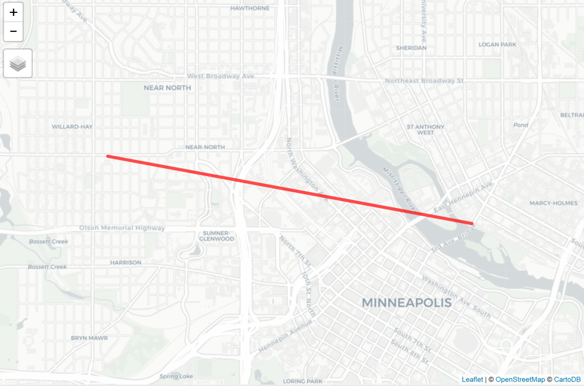
Then I visualized the first hire of 2017 as a desire line to ensure the package was working properly. Desire lines visualize trips, “as the crow flies”.
flow_single_line = flow[4,] # select only the first line
desire_line_single = od2line(flow = flow_single_line, zones = cents)
qtm(desire_line_single, lines.lwd = 5)
The next step was to create an object that included all desire lines between stations in 2017.
l = od2line(flow = f, zones = cents)
Before creating a visualization, I deleted all hires that started and ended at the same station. Including hires where origin = destination into the analysis would have effectively wasted computational power later on.
sel = l$Start.station.number == l$End.station.number
l = l[!sel, ]
Then I visualized all the desire lines.
qtm(l, lines.lwd = "hire", scale = 4)
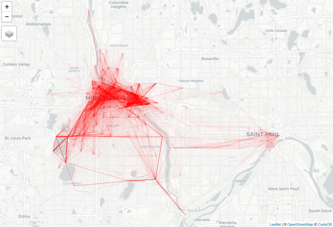
It’s possible to color code the desire lines based on the number of hires.
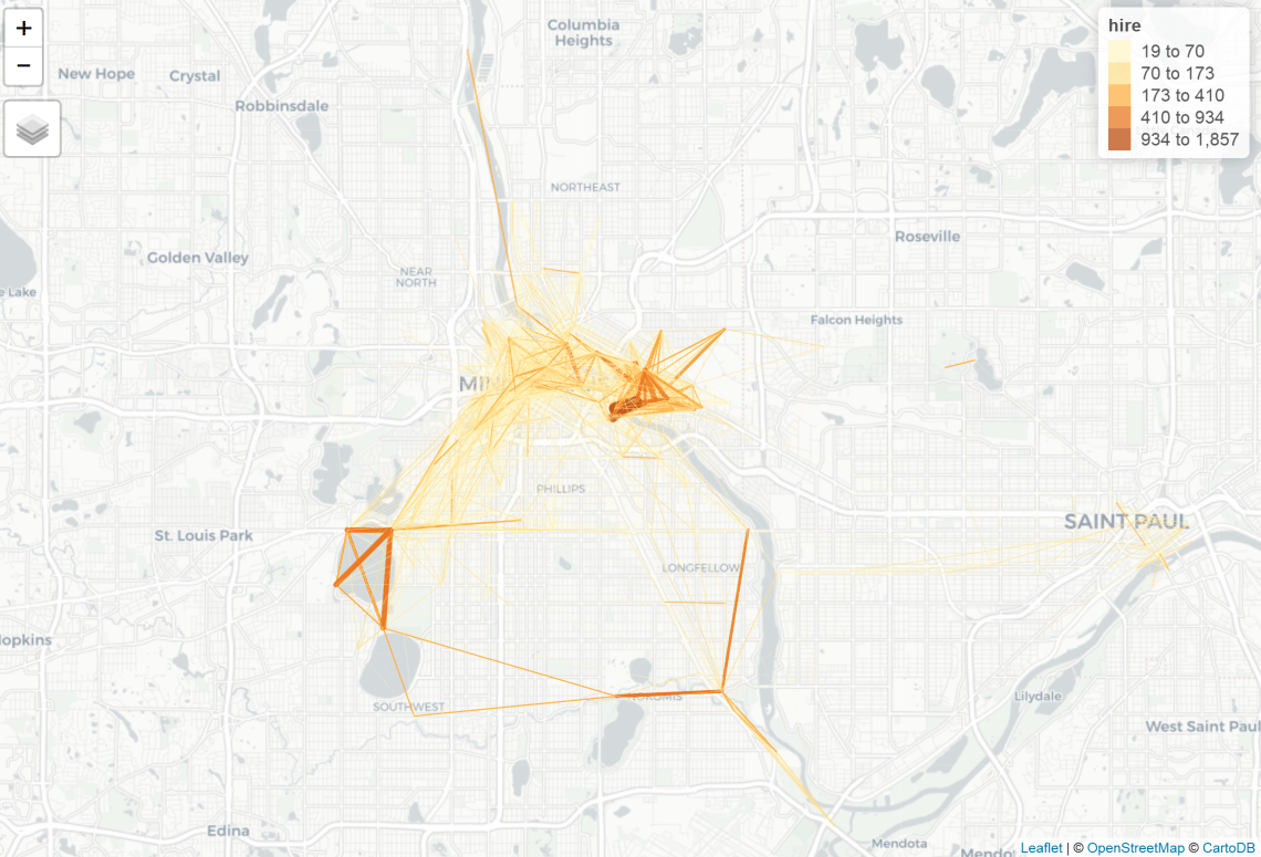
tm_shape(l) + tm_lines(lwd = "hire", scale = 10, col = "hire", style = "jenks")

I wanted to remove some of the overlappings in the image above, so I extracted the top 25% most popular station to station hires and visualized the subset. This helped increase clarity.
summary(l$hire)
>Min. 1st Qu. Median Mean 3rd Qu. Max.
>1.00 2.00 6.00 21.14 19.00 1857.00
ls <- subset(l, hire >= 19 )
tm_shape(ls) + tm_lines(lwd = "hire", scale = 10, col = "hire", style = "jenks")
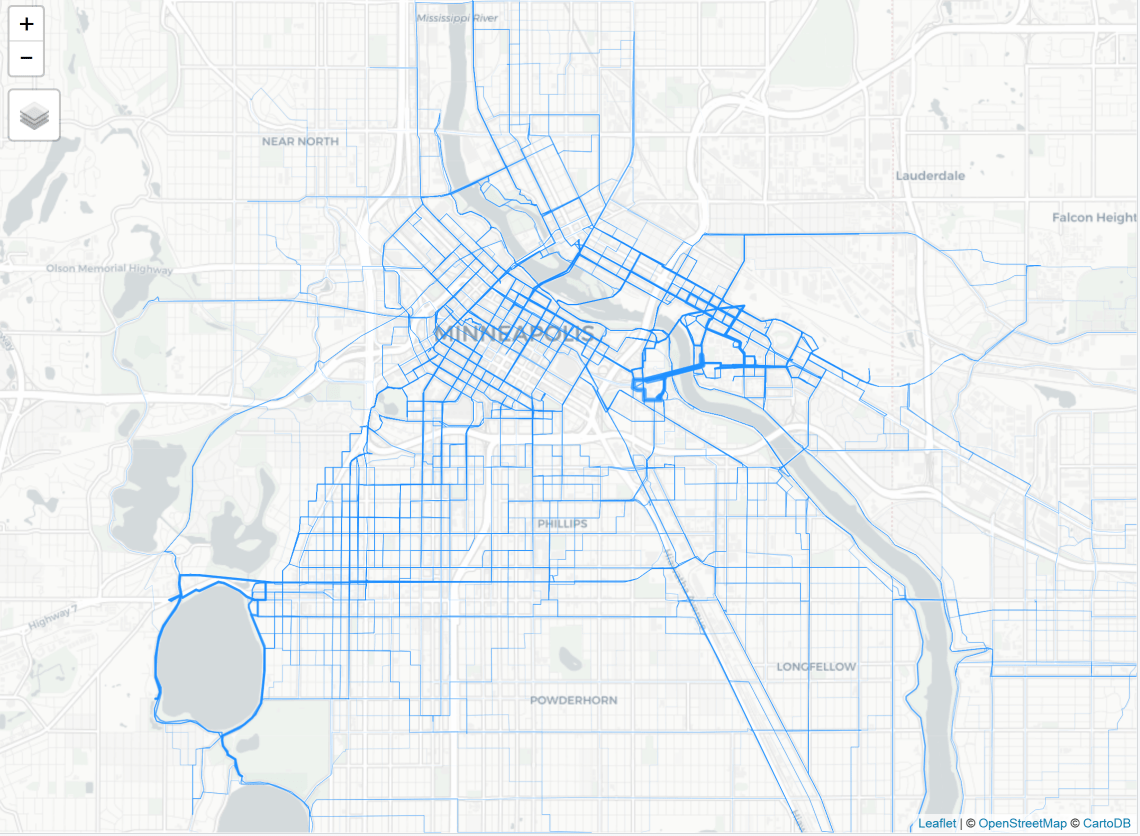
I created an object that included inferred route information for all trips using a cycle specific routing algorithm generated by GraphHopper. Then I merged the hire count data with the route data and visualized the results.
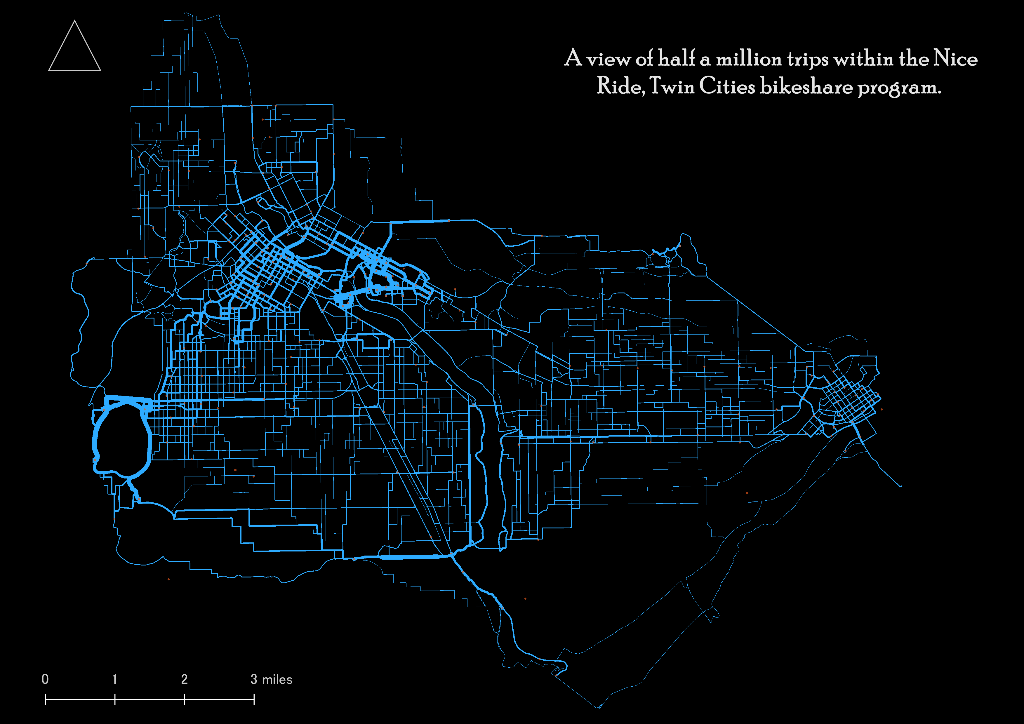
r = line2route(l, route_fun = route_graphhopper, vehicle = "bike")
r@data = cbind(r@data, l@data)
tm_shape(r) + tm_lines(lwd = "hire", col = "dodgerblue1")

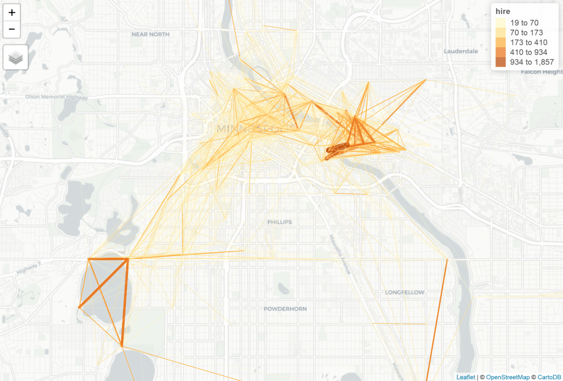
Here is a close up of Minneapolis.
To provide better context, I created a shapefile with the route information and imported it into QGIS where I improved the map by including a title, north arrow, scale, legend, as well as visualized the quantities a little differently (using the pretty breaks option under the graduated size visualization).
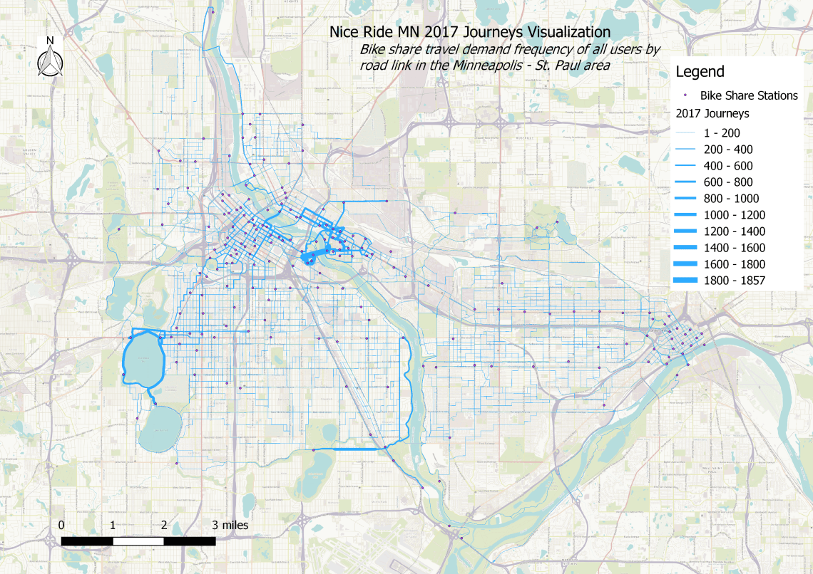
This type of mapping visualization could be used to share potential user route preferences and be useful in advocating for (or against) bike share program optimization, tailored marketing, bike share system expansions, corridor analyses, wayfinding planning, feasibility studies, modeling, master planning, and much more.
Visualizing Specific Groups and Intervals of Time Within the Data
The following maps were created to visualize inferred route preferences among different groups and intervals of time. This step broadens our understanding of how different types of people use the Minneapolis – St Paul transportation system by bike at different times of the day.
Total Casual

Casual trips were all trip with the “Account.type” variable coded as “Casual”. There were 170,646 trips made by members in 2017 or 37.0% of total trips.
Casual users routes gravitated towards the waters around the Twin Cities area. Closer to Minneapolis, there was heavy use around Bde Maka Ska (aka Lake Calhoun) area. This would be a great area to test special programs targeted at casual riders.
Other popular routes among casual users included the corridor along the Minnehaha Parkway between Lakes Hiawatha and Nokomia and the Mississippi River and Mississippi shores in the area. There was some casual use around the University of Minnesota and Downtown East area. The popularity of casual use in the Downtown East could (in part) have been connected to the U.S. Bank Stadium.
Total Member

Member trips were all trip with the “Account.type” variable coded as “Member”. There were 290,070 trips made by members in 2017 or 63.0% of total trips.
Member routes were heavily concentrated around the University of Minnesota and Washington Ave bridge. Other areas of relatively higher counts included areas along the Mississippi River and Bde Maka Ska, but the lion’s share of member routes were around the Dinkytown, Saint Anthony Main, and Marcey-Holmes neighborhoods.
Members AM Peak

The AM peak travel visualization was generated using all members who hired bikes between 6 and 9 AM, Monday – Friday. There were 46,252 made by members during these hours or 10.0% of total trips.
Compared with total member routes visualized above, the AM users were more evenly distributed throughout the city. The downtown Minneapolis area saw more member routes along the downtown streets, which suggests the program enjoys a healthy distribution of users working in the downtown area in addition to university student use.
Members PM Peak
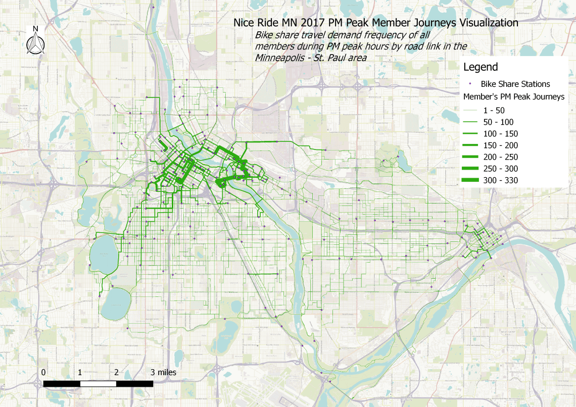
This visualization was generated with members who hired bicycles between 4 and 6 PM, Monday – Friday. There were 61,704 trips made by members during the evening hours or 13.4% of total trips.
The most popular routes concentrated around the Washington Ave bridge and the neighborhoods surrounding the University of Minnesota, as well as some corridors in the downtown area, notably 3rd Ave which includes high-quality bicycle facilities (albeit some parts adjacent to parked cars door zone without buffer)
Summary
The results of this analysis highlight one method to infer route preferences among bike share users at different levels using origin and destination data, the GraphHopper API, and stplanr in R. Results visualized route preferences among all users, members, and casual users, as well as the routes popular among AM and PM commuters. These results may be useful to urban and transportation planners who need to fill a gap in understanding network usage among local cyclists. The outputs could be used to discuss bike infrastructure or bike share system design. They could also be used to facilitate conversation around equity and inequity within a system.
This example should be reproducible following the methods described above. The code is provided throughout this post, but a complete script can be found here. To carry out this analysis you’ll (likely) want to read the stplanr manual and purchase a GraphHopper API token. Other routing algorithms are available through the stplanr package, notably one from cyclestreets.net, but that is only available in the UK and part of Europe. Other routing functions include Transport API and osrm.
For more information on the best practices of bike share use, see the Bike-share Planning Guide from the Institute for Transportation & Development Policy. There’s also the Bike Share Siting Guide from the National Association of City Transportation Officials. These documents (along with many others) may be useful to consider with the analysis completed above.
Keep riding!
Thanks

I’ve been thoroughly impressed by the work produced by Robin Lovelace and his team. The stplanr package for R is an exceptional addition the open source community and advances the state of practice in transportation planning. You can find a reference manual to the package here, and two vignettes here and here.
The breadth of this analysis would not have been possible without GraphHopper. GraphHopper provides routing services that are easy to use, fast, scalable, and can be integrated into a variety of projects. Their existing infrastructure is supported by a wide variety of programming languages. You can access the GraphHopper routing functions through the stplanr package in R.
The people who make GraphHopper possible are top quality and I would thoroughly recommend their services after putting them through the paces of this analysis. Check out their products.
This wouldn’t have been possible without the broad exceptional work from the Open Street Map (OSM) Foundation and community. Please consider becoming an active member.
