
Bike Sharing
A bike share program is a system of supplying bicycles for hire for point-to-point transportation. This program enables convenient active transportation as people have an option to cycle between two stations (or two points) in a defined geographical area. People can hire bicycles as casual (one-off) users or as long-term members. A long-term member is generally allowed unlimited free 30-minute rentals, with plateauing fees after the first 30 minutes. A casual user generally enjoys a similar pricing structure that plateaus over time. This pricing structure incentivizes short trips, which makes bike sharing ideal for commuting by bicycle. Cities have championed bike share programs for their ability to increase bicycle use and relieve road congestion. There were over 500 programs around the world by 2014, and today there’re over 600 programs. The largest systems are in China and Europe.
Long-term members benefit from suppliers privatizing the risk of owning a bicycle. Members don’t have to worry about bicycle maintenance, theft, or storage if they rely on a bike share program for thier trips. For more information on bike share systems, you can read this planning guide from the Institute of Transportation and Development Policy.
Professional planners and operation managers are focused on mining bicycle share data to understand patterns of use. Some examples of this work in academia are found here, here, here, and here. Other examples of mining bike share data are found here and here. These analyses can help optimize operations and cut down on unneeded expenses.
I used 2015 data from the Minneapolis – St. Paul Nice Ride Program to answer the following questions.
- Where is the Nice Ride program most popular?
- What spatial patterns exist between hires and arrivals?
- What is the relative distribution of hires between casual users and members?
- When is the Nice Ride program most popular among casual users and members?
The R code that I created to prep and visualize the data can be found on my GitHub page here (prep) and here (graph).
Otherwise, if you’re interested in the GIS to proceed, or have any other questions feel free to contact me here.
Visualizing Popularity
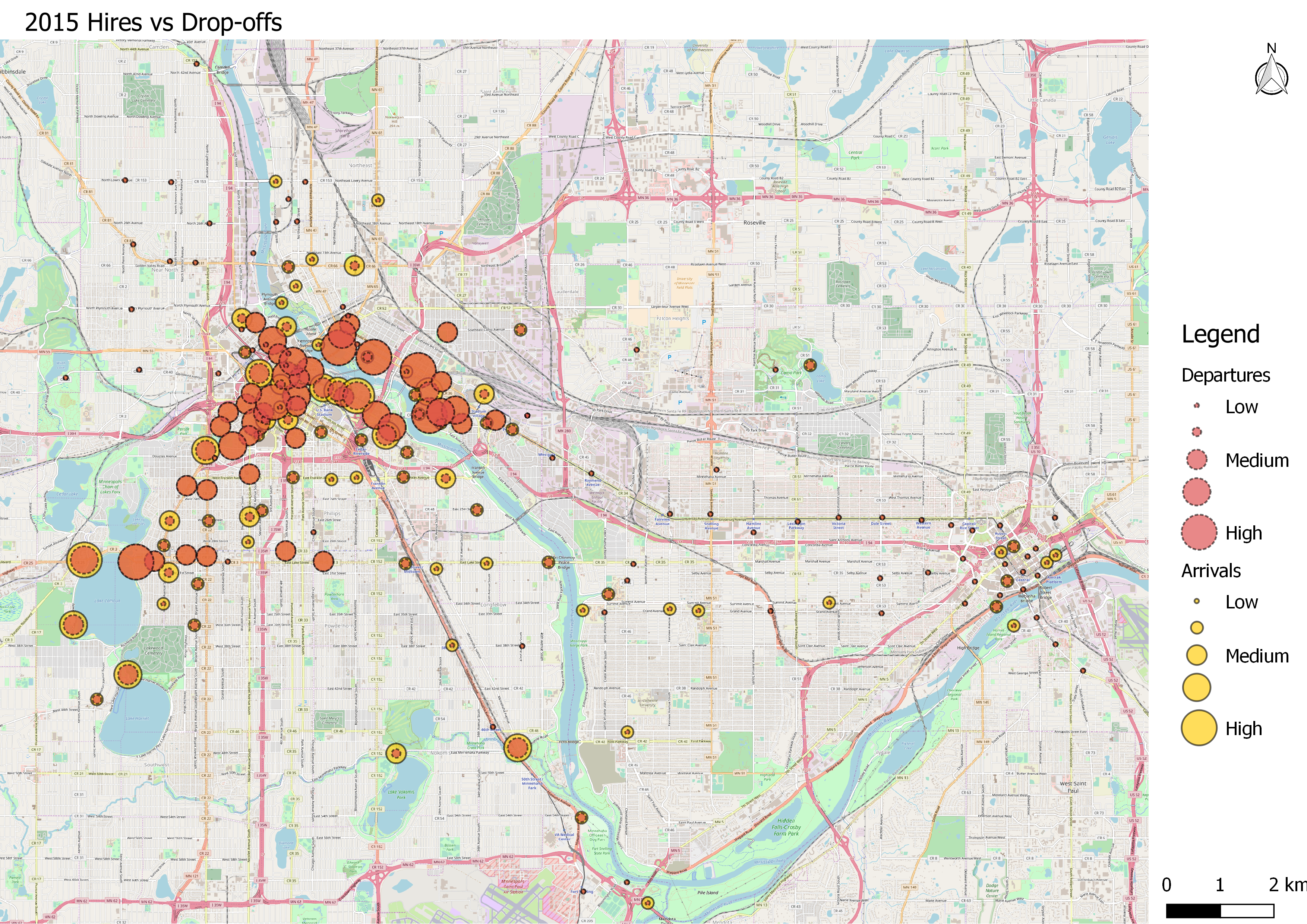
The map below includes circles which indicate the relative number of departures and arrivals for each station. It can help answer the following questions.
- Where is the Nice Ride program most popular?
- What spatial patterns exist between hires and arrivals?
To visualize the data, the number of departures and arrivals were summed up per stations and imported into QGIS, then mapped using the corresponding lat/longs. The parameters for the size of the circles were established using the jenks option.
Minneapolis experienced more departures and arrivals in 2015 than St. Paul and surrounding areas. The map shows relatively low levels of use along the east/west corridor between Minneapolis and St. Paul, as well as the north-west of Minneapolis.
The rebalancing problem is a result of more bikes returning to a station than being hired and where the demand for hires is greater than the demand for arrivals. It is a primary concern for cities with bike share programs including New York, Washington D.C., Portland, and Houston. The problem is visible in the Twin Cities where the yellow circles are larger than the red circles (and vis verses). At these stations, the system was unbalanced in 2015. There are a number of complex solutions to this problem which you can read about here, here, here, and here. One solution for program managers includes, offering incentives in the form of gift cards, free trips, or money that encourage users to drop off/pick up bikes at misbalanced stations.
Casual v.s. Member Distribution
Another variable in the Nice Ride rental dataset is the account type recording for each hire. This variable is categorical and has two values, casual and member. The recording indicates when a one-off user or a long-term member rented the bike. One unknown account type was registered in the data. I eliminated it from this study.
Mapping the account type with pie charts for each station gives a general sense of relative casual vs. member user distribution. I used it to answer the question.
- What is the relative distribution of hires between casual users and members?
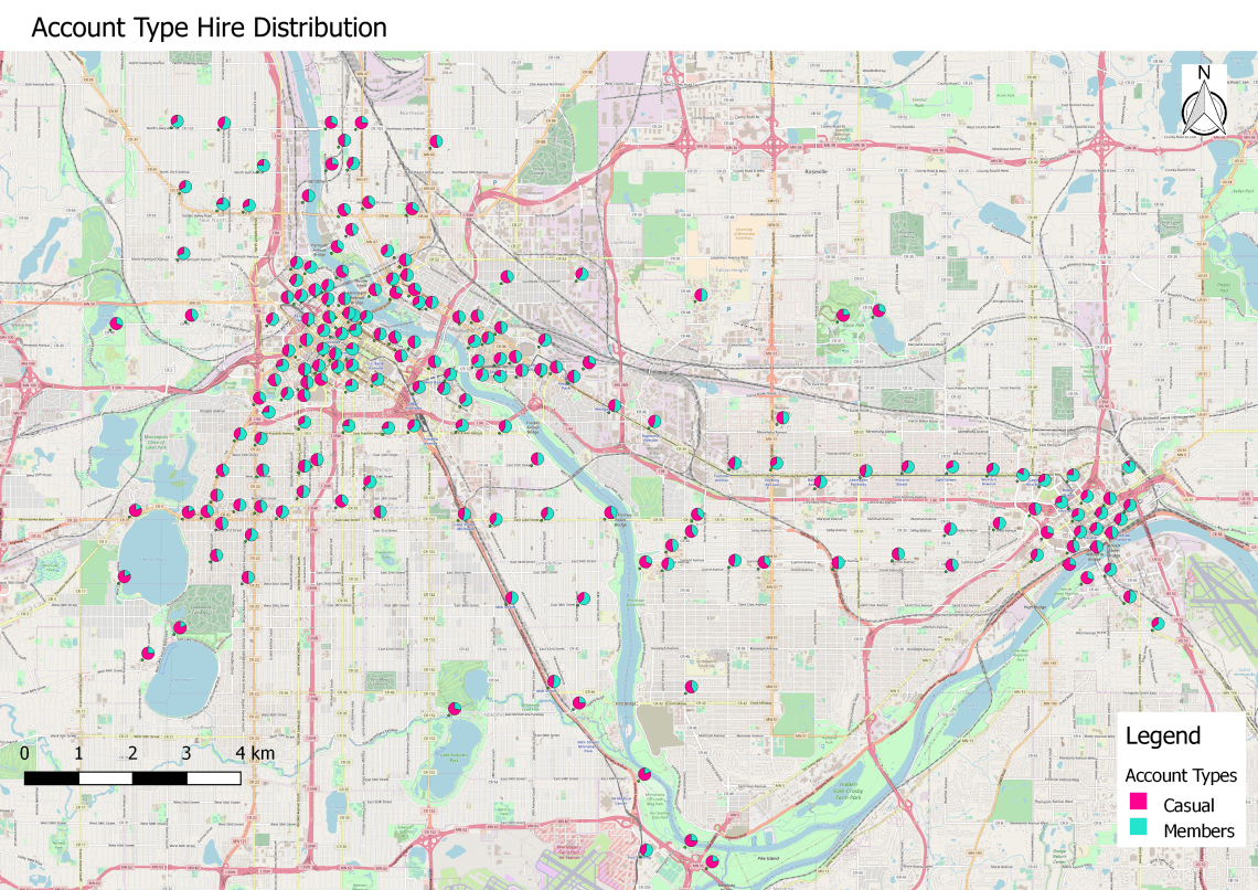
I was not surprised to see strong member usage in the city centers of Minneapolis and St. Paul. These are places with lots of human interaction, where commuting by bicycle is effective and efficient. However, some stations in the centers had more casual users v.s. members. This included stations in the southwest and northeast of Minneapolis, as well as the south of St. Paul.
In terms of management, areas with higher casual users may want to ensure instruction boards are legible and bikes are available for hire. Otherwise, casual hires (money) might be lost.
Using the first two maps, we can see the volume of hires at stations and the relative distribution of users. Managers could use a combination of this information to support pilot programs, such as add-ons (trail maps or GPS capability for casual users), or advertisements (local food chain for members).
When is the program most popular? (and by whom..)
The graph highlights the difference in usage patterns among casual users and members during the week in 2015. It helps answer the following question.
- When is the Nice Ride program most popular among casual users and members?
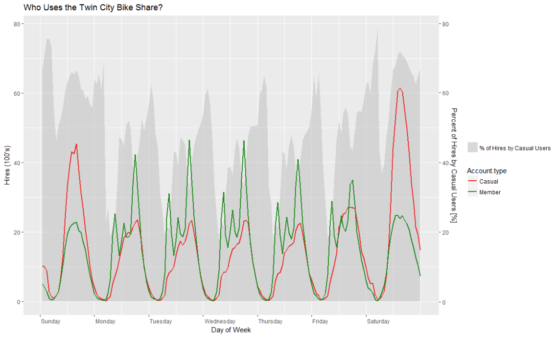
Using the left title, you’ll see I divided the number of hourly hires by 100. I had to divide the values to get all the percentage and hire data on one graph. The red line indicates hourly hires by casual users. The green line represents the hourly hires by members. The grey space indicates the percent of causal users per hour.
The graph highlights that members tended to use the bikes during peak travel hours. However, there seems to be an extra peak around lunchtime. Member usage tended to be the highest Monday – Thursday. Casual users tended to use the system on weekends, with Saturday being most popular. Friday was slightly more popular than Monday – Thursday.
Final Thoughts
- Highest usage pattern in Minneapolis
- Member use was high in the city centers
- Casual users were popular among some areas in the cities
- Members traveled during peak travel hours, and at lunch
- Balanced usage between casual users and members
- High casual use on weekends, especially on Saturdays
