As I’ve said in other places, I love R and building shiny apps has been a great way to show that love. Here’s a tool to help explore Boston’s bike share program.
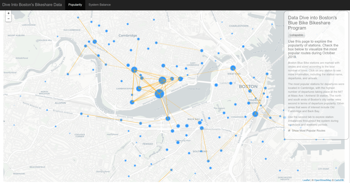
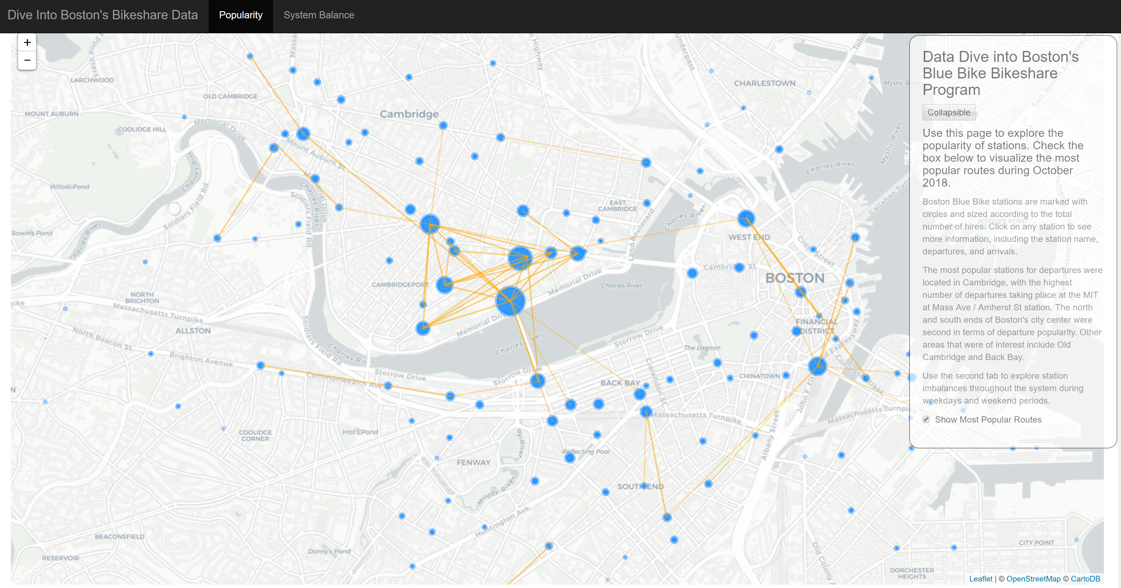
This data-driven tool was designed with exploration in mind. It’s intended for the reader to become rapidly familiar with bike departures and arrivals within the Boston Bluebikes bikeshare system using data from October 2018. It’s a tool for analyzing the popularity of hires from an individual station standpoint. It’s also useful to answer the question, “Where might the bike share system have a rebalancing problem?”. This tool could be used to address this problem in Boston. You can open the app via the link below to dive into the Boston Blue Bike data yourself. There’s even an option to visualize desire lines between the most popular stations.
View a live demo of the tool in action.